
The Red Hose
Design for function? Or aesthetics? Can we have both?

This book is one of the most important books I’ve ever read. It changed and informed how I see the world and its objects. It has also led to some interesting conversations with folks who see the world through a very different lens.

I recently bought a new garden hose that needed to be long, sturdy and proof against leaks and kinks. That narrowed the choices and drove up the price. But I found what I needed, and it worked the treat.
That evening the 20-year-old confronted me about it. For a change, she didn’t look angry or disdainful.
She looked sad. I was afraid one of our baby chicks had died.
“Why?” she asked, “Why did you get a red garden hose?”
I was dumbfounded. Red? What in the world? What did color have to do with anything in this context?
Once I recovered the power of speech, I explained what it was being used for and what qualities it needed to have to do that job. And how those constraints narrowed the choices to that specific hose. There were no color choices; red was the only option.
“But why is it red?” she asked again, sad and now maybe a bit frustrated.
I explained that the various grades of hoses on offer were different colors, probably so customers would clearly know when they were buying a more expensive (and more capable) hose.
She was deeply unsatisfied with this explanation. She never said it out loud, but I inferred from past experience that she has definite, traditional ideas about these things. Garden hoses are green. Full stop. Not red, not black, not gray (all options, btw). Green.
This hit a real nerve with me about functional vs. aesthetic design. Her older sister and I had had a long and interesting discussion about this very topic the previous weekend.
I am, not surprisingly, down on the side of design-for-function first. But I also believe that aesthetics matter. And that there can be beauty in a well-designed item where the design supports its function in an elegant fashion. Think the original iPod.
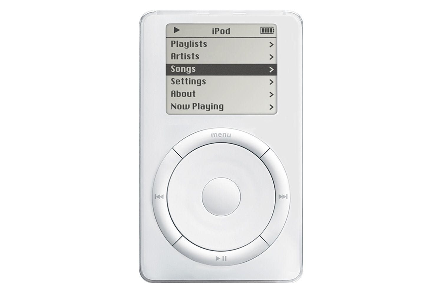
It’s hard to remember that 25 years ago, the state of the art looked like a misshapen CD player:

Without going down the rabbit hole too deeply, I hope that it is clear that the iPod brought dramatically improved functional and aesthetic design to the market. It was more compact, higher capacity, introduced touch controls (the selection wheel) and was, in every way a huge leap forward. There are no smartphones as we know them without the iPod.
There was no color selection - basic white was it. In my opinion, the right choice. With so much else that was new, let the color fade out of the picture.
But, as much as Apple generally gets things right in the balance of function and aesthetics, sometimes they blow it.
I recently went to their store which was fronted by a beautiful high wall of lighly tinted glass. Bringing the outside in, as it were. Lovely.
But where was the door? How to enter this rarified palace of tech with its friendly, competent employees eager to help?
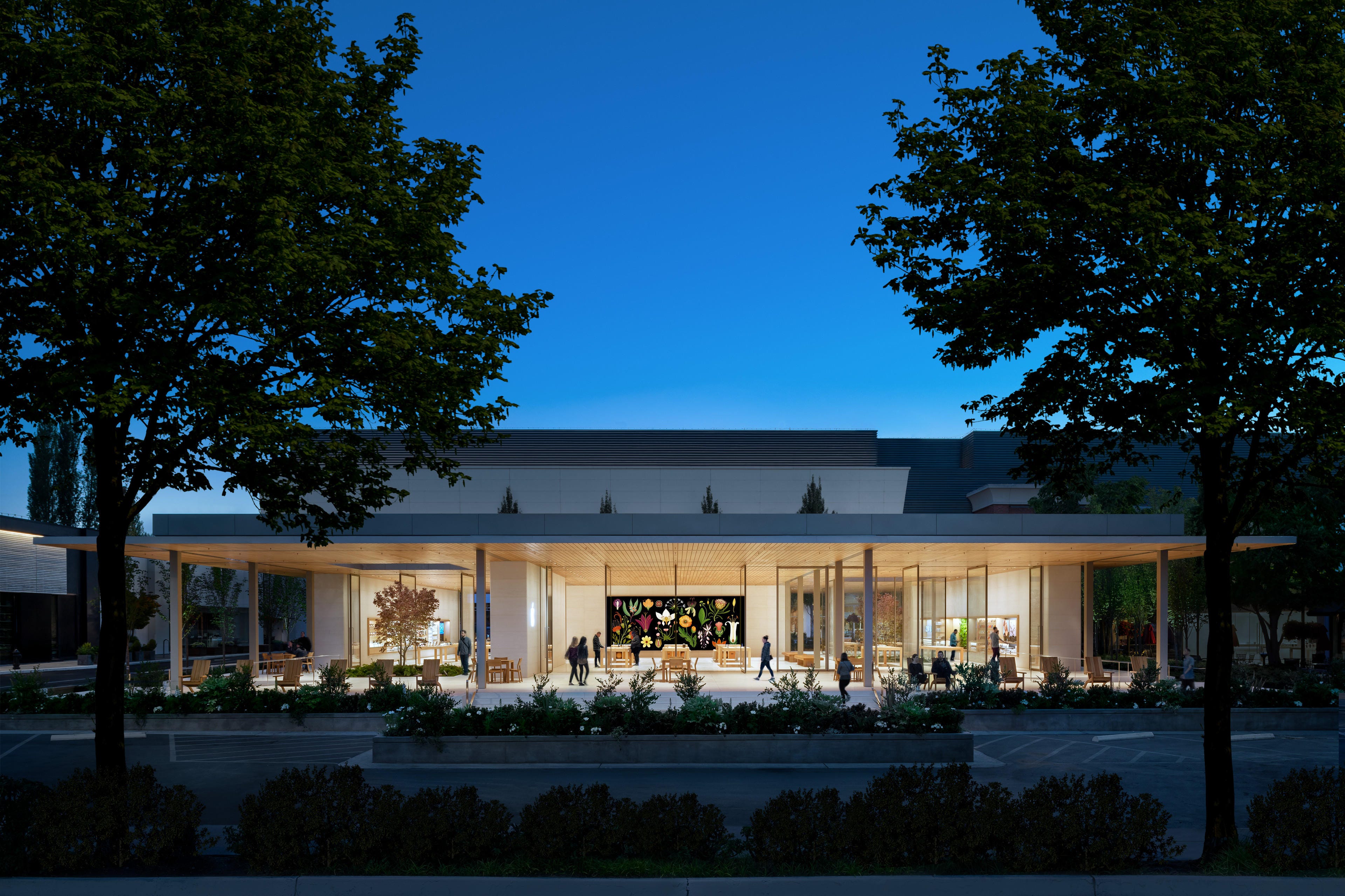
Can you spot the door? It took me a minute. Once you find it, it’s not clear which way it pivots. And it’s heavy and challenging to open once you sort all that out. I had to hold it open for a young family with a stroller. Impossible for one person to do it.
Apple preserved its uber-clean aesthetic at the expense of basic functionality. I will assert that if you want people to come into your store you should probably make that as easy as possible.
Call me crazy. Or an old crank. I’ve been called worse.
I have no grand conclusion here, but if even one person is moved to read more, to look into Donald Norman’s seminal work, it will have been worth it. Might push the world to cleaner, more functional, more usable design.